


Judging magazines by their ads
A glossy is only as neat as the ads that populate its pages

“Every day’s an endless stream / of cigarettes and magazines”
— Paul Simon
I don’t have a job right now. Each day I pray someone will pop out of the woodwork and bequeath me a sinecure, but, in the meantime, I “Easy Apply” on Indeed, drink coffee, and crack open the dozens of magazines littering every surface of my room.
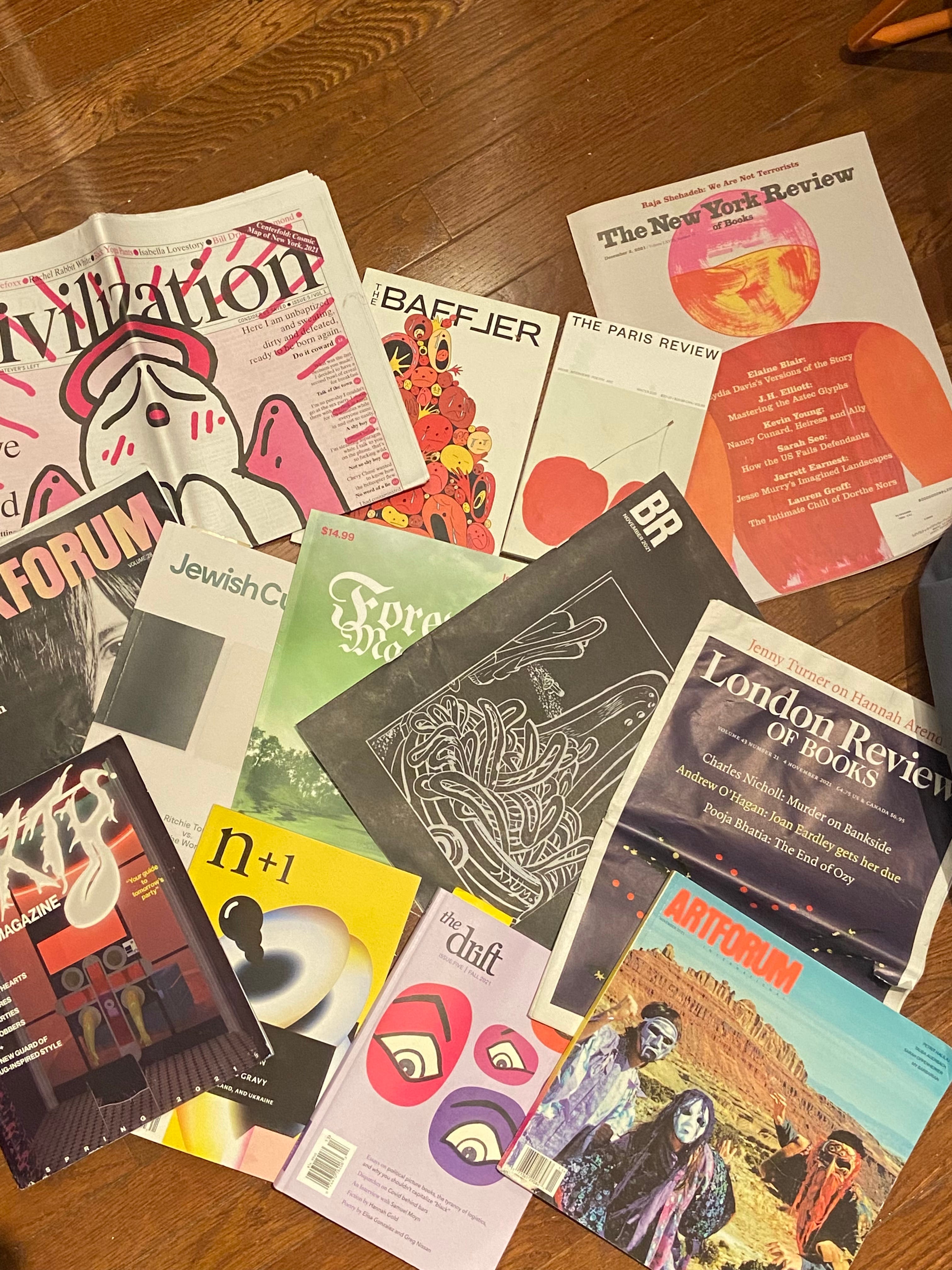
I subscribe to seven mags / literary reviews (which I call magazines) and pick up several more from newsstands. One of New York’s special throwbacks is its occasional deli papered in New York magazines, crowded like a hoarder’s apartment with papers, and sustained by those who still respect printed matter (and like overpaying for Apartmento).
Each magazine is its own experience, but each has a few things in common: a masthead, articles, blah blah blah. Mainly, though, each has advertisements. Ads, which are separate from editorial, still reflect the magazine’s ethos. A glossy is only as neat as the ads that populate its pages.
“We are so accustomed to being addressed by these images that we scarcely notice their total impact,” John Berger wrote of ads in his seminal semiotic text Ways of Seeing. His Marxist critique criticizes ads as producing images imbued with wanton desire. He says they reproduce glamour, which we all wish to possess. I mean, yeah, true. My lens, however, is more of a capitalist slave looking to buy a few nice things before they’re seized in the Water Wars of 2045.
I will attempt to read the ads as if they were the articles and report back which mags are tight and which are whatevs.
Downtown cool:
Sex Magazine - Issue #12 of Sex Magazine, which I picked up at the launch at Mast Books, features on the cover problematic fave Anna K. of Red Scare show by transgressive filmmaker and photog Richard Kern. While Dasha was having her 15 minutes on season 3 of Succession, Anna had a baby. There’s a 48 percent chance its first word will be “retard.” Anyway, the interviews are all quite good. Impresario Asher Penn asks thoughtful questions. Anna dishes out some good quotes, such as this critique of current media:
The process is too “design by committee.” There’s too much oversight by too many people, most of who publish throwaway content, have middling instincts, and are in the business of lying to themselves and their audience.
Daming and correct. But this isn’t a review of the magazine. It’s about its ads. First verso page features Ali Michael, an “it girl” to some, in a hip fluorescent green color that says “Father” and “Son” on the top with the bottom labeled “Holy Spirit.” The photo is by Petra Collins, who surely has had her day, and the fit is via the brand Praying, one of dozens of brands attempting to bring God back from the dead. Its website is complicated and most of the wares tacky. (My preferred Biblical webstore is i-need-god dot com.) The Yankees camo hat, however, is a serve.

The Drunken Canal has an ad. This is common": Magazines tipping their hats to each other. The ad features a balding man reading the paper’s fourth issue while his pretty, blonde wife, holding a dog and donning sunglasses indoors, looks over his shoulder. It’s a good ad.

Last one I’ll describe is a provocative one. A screaming man holds a drill up to his head. His hair is tightly cropped and what little is left is dyed pink. He’s shirtless. Above the ad reads in all caps, “I DON’T NEED THERAPY WHAT I NEED IS A FUCKING TSHIRT!” I followed the ad to its site and found myself wanting a T-shirt. I laughed at the crudely drawn Mickey Mouse shirt that reads “sue me bitch.” The shirts are as bellicose as the ad. Another says, “QUEER FOR CLOUT.” Who wouldn’t wanna rock that?
Verdict: 5/5
Naturally, The Drunken Canal – A milestone, the Canal now has 10 issues. Mazel tov Claire and Gutes. Everyone downtown has been trying to hitch their wagon to these two wunderkinder of cool—myself included (see my middling comedy piece in issue 5, which the girlies accidentally clipped when copying and pasting it into the word processor). The glitz and glam of the early days has been eclipsed— people weren’t joking when they said they don’t really read it—but I still pick up new issues and the snippets I do check out always make me laugh.
The ads: Some history first: The Susan Alexendra and Eckhaus Latta ads in past issues were early signs of cool recognizing cool. Now, what do we have? The first ad is for a book called The Joy of Basketball: An Encylopedia of the Modern Game. It’s 753 pages. Nobody reads encyclopedias; an encyclopedia is a piece of ephemera that gestures toward taste and is occasionally perused. Sound familiar?
(I don’t have hate in my heart, though. Just snark. Dunking on the Canal is a lot easier than putting together an issue, I’m sure.) Next ad: This one feels more on-brand, Heaven I Stay. The glitchy font, the skinny girl in a trenchcoat with an oversized collar wearing wraparound sunglasses looks like she just came off a Balenciaga runway. I followed the QR code to the site to get an idea of what it sells. The about section explained they are hawkers of wares from, “pre-loved vintage designer[s]” and “Most items are from the 1990s-2000’s.” This weekend, my Zoomer sister was kvetching as she tried to locate a vintage Tiffany charm bracelet so I can confirm that that early aughts fashion is back, baby. The prices seem reasonable and the website design is cool.
Last one I’ll go over: There are two black and white photographs stacked on top of each other. The top one sees two older dudes with laptops on their knees. (Older here means mid-30s maybe.) There’s a copy of what looks like a complete collection of William Blake’s poetry, which is, as a poet, I approve of. The duo makes music under the name The Hellp and the ad is for its EP, Enemy. It’s not exactly listening music. It’s more like what I’d expect to dance to in a cloud of fog at Rash or the stuff I’d have blurbed at Brooklyn Vegan back in the day,(e.g. 2010s-core).
Verdict: 3/5
Civilization isn’t readable. It’s a huge, foldout broadsheet that I only bought for the downtown cool map. The text is overcrowded and too busy to scan even if you’ve downed two Monsters. If you don’t know what this mag is, consider yourself more saved than the k-addled cool kids clutching their rosaries in their Chinatown shitbox apartments. There are no ads in this magazine. I hate this magazine. I am not on the cool map and I truly don’t care.
Verdict: 2/5
Forever Magazine is a magazine that ignored my great Guy Fieri story in order to publish a bunch of writers who could get a story placed on the front of the Wheaties cereal box if they so desired. The Issue 02 launch party was fun and more crowded than a rush-hour train in Japan.
First ad: Gemma N. A. Hunt logo in the center, though it’s hard to read exactly what it says. The background looks like a wrinkled black trash bag and sprawled across it are silver necklaces, discarded shrimp tails, and part of an orange peel, I believe. The site features handmade chain necklaces and rings. They’re cool but pricey.
The next one is Montez Press Radio. Apparently, you haven’t made it until you’ve gotten the Montez co-sign. Montez runs a space in the LES where scenesters talk on the radio. All the episodes run live just like real radio and you can sub to listen back or find the schedule and hope.
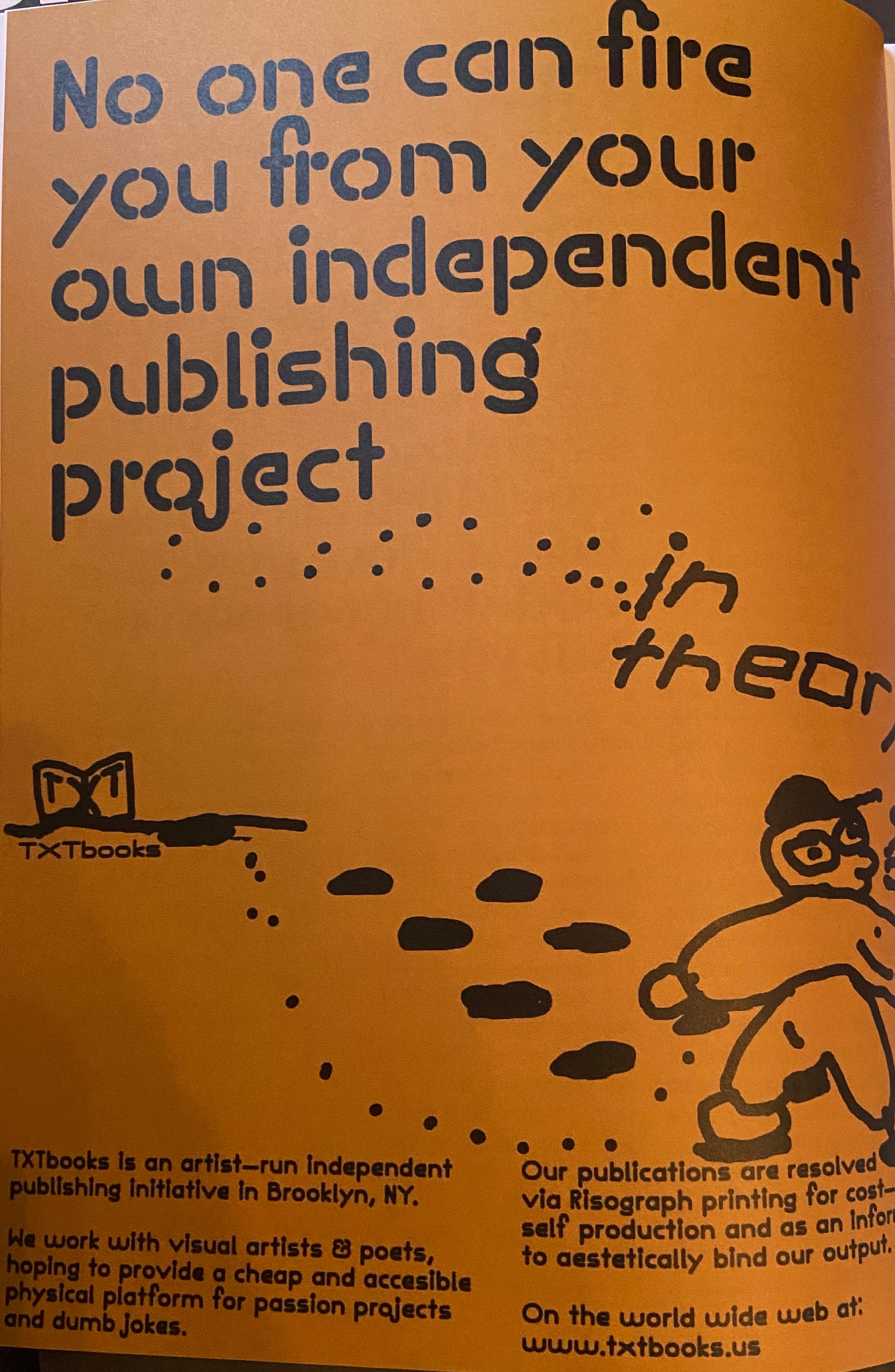
This last one piques my interest as someone who generally self-publishes. It says, “No one can fire you from your own independent publishing project… in theory.” It’s for a publishing initiative in Brooklyn, NY (hey, I live there) and it features a crappy drawing of a person that is maybe one level up in technique from a stickman. I’m going to see if I can publish a poetry chapbook. This ad is useful. Thank you Forever.
Verdict: 5/5
Dirty is a magazine that I bought because I was writing a story on it for another publication. The story got cut because my editor left the publication and now I have thousands of words on something that will likely never see the light of day. That and a one-sided grudge with its EIC for disappearing. The mag has two issues now but I only have the first. It’s a peaen to drugs and sex, how neat.
As for the ads, there’s one for Ben Fama’s Wonder press right above a mood ring for your cock. That’s kinda fun. Nextdoor is an ad for Montez Press Radio, which features the station’s name stamped over and over and over and over and over again, its repetition forming a sort of hurricane of the words Montez Press Radio.
At the issue launch, the woman who runs 69 Herbs, Jade, was perhaps the nicest of all the people I interviewed. Her site says it’s a New York-based apothecary and design project. The ad features a woman on her knees, arms pressed forward, holding some dark purple dasies. She’s covered in tatooos, which means she’s cool.
Verdict: 4/5
Art crit:
Artforum — This is less a magazine and more a collection of ads with some content interspersed. More than 70 years ago Adorno and Horkheimer wrote, “In the most influential American magazines, Life and Fortune, a quick glance can now scarcely distinguish advertising from editorial picture and text.” This feels true today of Artforum, though I’d ascribe less cynicism to its editorial wing. Regardless, I love getting swindled when I buy it at the newsstand (cover price $16.99). A good ad informs. As someone who loves the galleries—and most of the ads are for galleries—I often add shows to my wandering list of what to see in Chelsea, LES, SoHo, and beyond based on what’s advertised in these pages. My other reaction is shaking my fist ruefully when I see something intriguing and it turns out to be in Paris or London.
In the most current issue, November Vol. 60, No. 3, there are, of course, lots of ads for shows. I marked down on my calendar to visit Francesca Woodman @ Marian Goodman, Brice Marden @ Gagosian (my computer background has been a Brice Marden painting for at least two years), Paulina Olowska @ Metro Pictures, and Sylvia Snowden @ franklin parrasch. I would likely have missed a few of these had I not been made aware by the ads. The ads themselves do little more than announce the work. It’s classy.
Around page 80, there is an ad for Eckhaus Latta. A person of a dubious gender stands slightly hunched, hands on knees, with their legs splayed out like Charlie Chaplin. They have a sleeve of tattoos and a fringe haircut. I don’t particularly love the outfit, but I bet it would make just about anybody look chic.
Some other ads are for Princeton University Press, which focuses its efforts on selling art books for this ad. UBS has an ad for Art Basel Miami Beach, which makes sense because cocaine can’t advertise the event. There was one other art press and unless I missed it every ad was either for a museum or gallery. I guess the advertisers know the score.
Verdict: 4/5
Probably the most pretentious magazine I read is The Brooklyn Rail. I usually only make it through a few reviews and an article or two but it’s low stakes since it’s free. The interviews are also good and introduce me to new artists or new things about old ones. Oh, and don’t skip the poetry.
November’s issue opens with an ad announcing Chris Marker’s show at Peter Blum Gallery. I love La Jetée (1962). I’d go to that. In color, there are several full-page ads for two shows at Zwirner, one at Gagosian, two for Craig F. Starr, two for Lisson Gallery, and a half-page each for Sikkema Jenkins & Co and Alexandre. On the back cover is the excellent Picasso show at Acquavella, which I reviewed for my other blog. The ads are not much more than signposts up ahead. I like their simplicity. They are all for art. Very pure.
Verdict: 4/5
Lit mag:
Ahh N+1. I love cracking this open and reading it cover to cover. Each issue gets its own page on Goodreads so I get my fill and I get credit for it, too. The general vibe of this journal is leftist intellectual who likes to shitpost and hates neo-libs—something like that, anyway. I’ve been subscribing for several years now and I always enjoy the articles, which hip me to things nobody else is covering. Current issue “Number Forty-One: Snake Oil” just hit my mailbox so let’s take a look.
Back when it did in-person events, N+1 hosted out of the Verso loft. There’s an established relationship. So it’s not a surprise there’s an ad for the Verso Book Club. Verso, for those not in the know, is “the largest independent, radical publishing house in the English-speaking world,” as the site says. It’s where you’d get a translation of Lacan or Badiou if that’s your cup of tea. Apparently, its office politics aren’t as revolutionary as what’s espoused in its books, but it’s possible management has made some strides since that post went up early this year.
Anyway, more on ads. The Montreal label Constellation has an ad that is a photo of a stoplight. Underneath it lists the Fall 2021 releases. I never thought of N+1 readers as having a shared musical interest. I gotta admit I don’t know this label so I listened to the first song or two on each release listed. My takeaway: it’s mostly decently nice ambient. I probs wouldn’t buy any of it, though Sofa stood out.
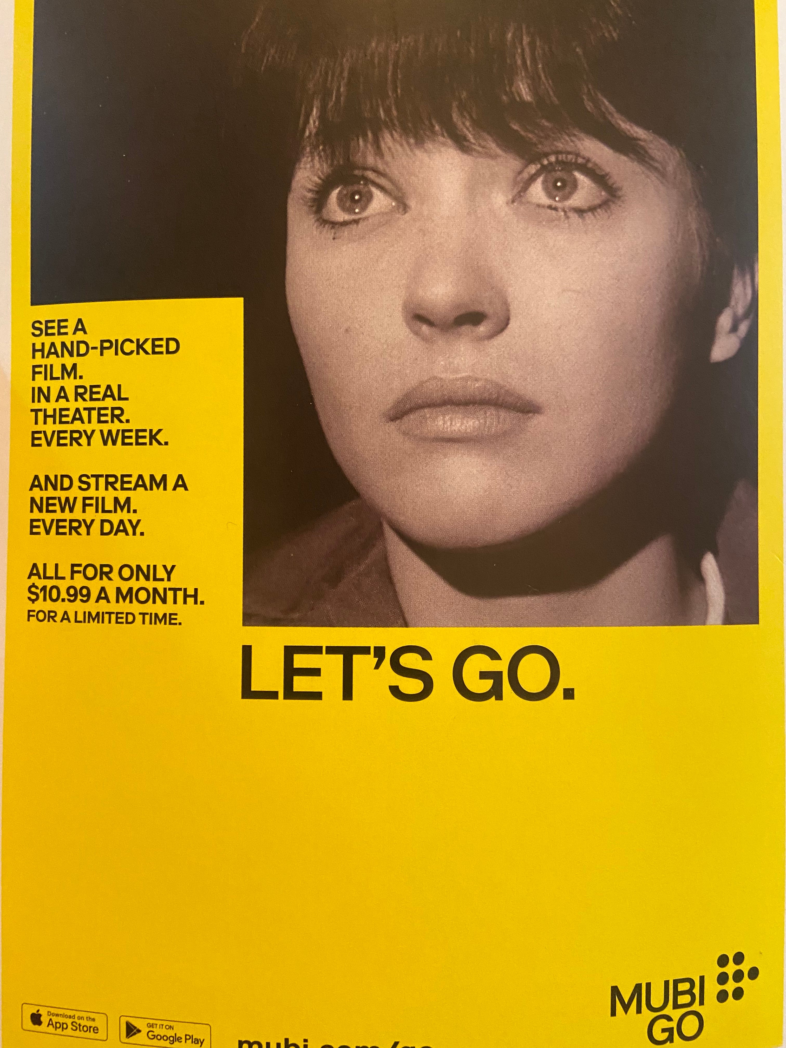
The back cover features a Mubi ad that is a black and white photo of Anna Karina about to cry in the theater from Vivre se vie. It’s very much a nod to the film bro and I think it’s effective. This mag is light on ads. I wrote about most of all of them apart from the one that hips you to The Jewish Currents, a good leftist rag to which I also subscribe.
Verdict: 3/5
Hurrah, a very pretty issue of The Paris Review just arrived (I’ve been writing this over several Adderall’d bouts of inspiration). The cover is two red cherries, stems connected, painted by Rose Wylie. This magazine is an O.G. It’s been around for nearly 70 years and has some real history, which you can peruse at your own leisure on its Wikipedia page.
The ads are primo stuff. First one is for Hermes, which is classy. It probably costs more for the luxury brand’s cheapest accessory than it would to commission one of these published poets to write an ode to my toaster. Sorry, baby, that’s just showbiz. While that one features two models with mid-2000s floppy hair in their eyes, the next one—for Gabriela Hearst—is more artistic. I can’t tell exactly what’s going on (is it a discarded pastery on a plate?) but, all the same, its site doesn’t do much for me. On it, you can buy a basic cardigan for what amounts to more than the entire monthly rent of my three bedroom unit. But I guess that’s not surprising.

One more for good measure: There’s an ad for Warby Parker in the back. It’s black and white and features a bunch of banged-up back issues of The Paris Review atop of which rests a pair of chunky frames. I am def not the modicum of cool but I rocked Warbys for several years. This probably is a neutral fact. It’s neat that the glasses store sells books in it. It’s a natural pairing. Might as well make use of the SoHo location’s space and hawk some paperbacks. The ad says, “ALL OUR GLASSES ARE READING GLASSES.” Glad they differentiated. I wouldn’t want to get confused and accidentally grab my shitting bifocals.
Verdict: 3/5
Bookforum is an excellent magazine. The reviews aren’t streamlined to sound like Bookforum the magazine but instead like the individual voices of their authors. I laugh reading Bookforum. Can’t say that often of other book review pubs. The cast and crew there are always on point and readable.
But how are the ads? First one in the DEC / JAN / FEB issue is for a new literary magazine called The Continental Literary Magazine. It features work from some big names: Chomsky, Roxane Gay. And then authors I don’t recognize and whose names, based on the accent symbols, I’d likely mispronounce. The ad itself is nothing from nothing, as my grandma would say. It’s a red background with the names of the authors running up and down it. Cool.
Most of the ads are for presses. Every mag must have its niche. Here is one for Yale University Press’ upcoming books and here’s one for Artful Books. I don’t think I’ve ever seen an ad for a book and then bought it. I much prefer recommendations via real people such as authors, website writers, and pretty girls I follow on Instagram who know about the next thing months before it’s the next thing. In fact, all the ads are for book presses. I would expect a little more diversity, but alas.
Verdict: 2/5
The New York Review of Books shows up every two weeks and I read the first five articles. Each is like a mini-podcast. These are less reviews of a book and more overviews of a niche subject.
It’s pretty much all book presses, but there’s a nice ad for a Brice Marden print from Josh Pazda Hiram Butler. There’s also one for a new PBS documentary, a film by Ken Burns, on Muhammad Ali. The tagline: BIGGER THAN BOXING. LARGER THAN LIFE.” OK! Finally, there’s a page of current listings for galleries and museums. At least there’s some diversification.
Verdict: 3/5
I’m a few behind with my copy of the London Review of Books. My friend Jessie gave me Volume 43 Number 21 from early November. I read only a few articles. The prose can only be described as anal-retentive.
The ads are for…you guessed it, book presses. Here’s one for the New Left Review, which is really just a cover of the issue and a quote from someone about Germany’s future without Merkel. Someone should pay me for art direction. LRB also has the Contintal lit mag ad. Lastly, there’s an ad for a light that reduces eyestrain. They seem to know their readers.
Verdict: 2/5
Leftist rag:
Famously, The Baffler has no ads. That’s actually pretty cool. Space between articles is either nonexistent or dedicated to poems. There is, however, one page—the first—where the magazine advertises its own products. The Baffler tote bag for $12 is a good deal. The logo is doubled into a square that is, ouroboros-like, eating itself. The Your Lifestyle Sucks hat ($25) is a bit cringe and the David Brooks toilet paper roll ($15), which features The New York Times columnist’s face on two-ply TP, is a rip-off gag gift.
Verdict: 4/5
As far as I know, The Drift is the newest leftist mag to drop. I hope it has a long life. There’s a lot of buzz around this one. Lots of goodwill. I won’t detract from that. Issue Five is the first print issue. It’s a good mix of politics, fiction, poetry, and—my favorite—the mentions section, which is essentially mini-reviews. The ads are sparse. Perhaps I should go easy because it is the inaugural turn in print and most of the ads are for the magazine we are reading.
Other ads are mostly for the other leftist rags out there. One is for lit journal Nat. Brut, which publishes fiction and poetry, as well as a section of personal essays, which in the current issue comes with this warning: CW: family/generational trauma.
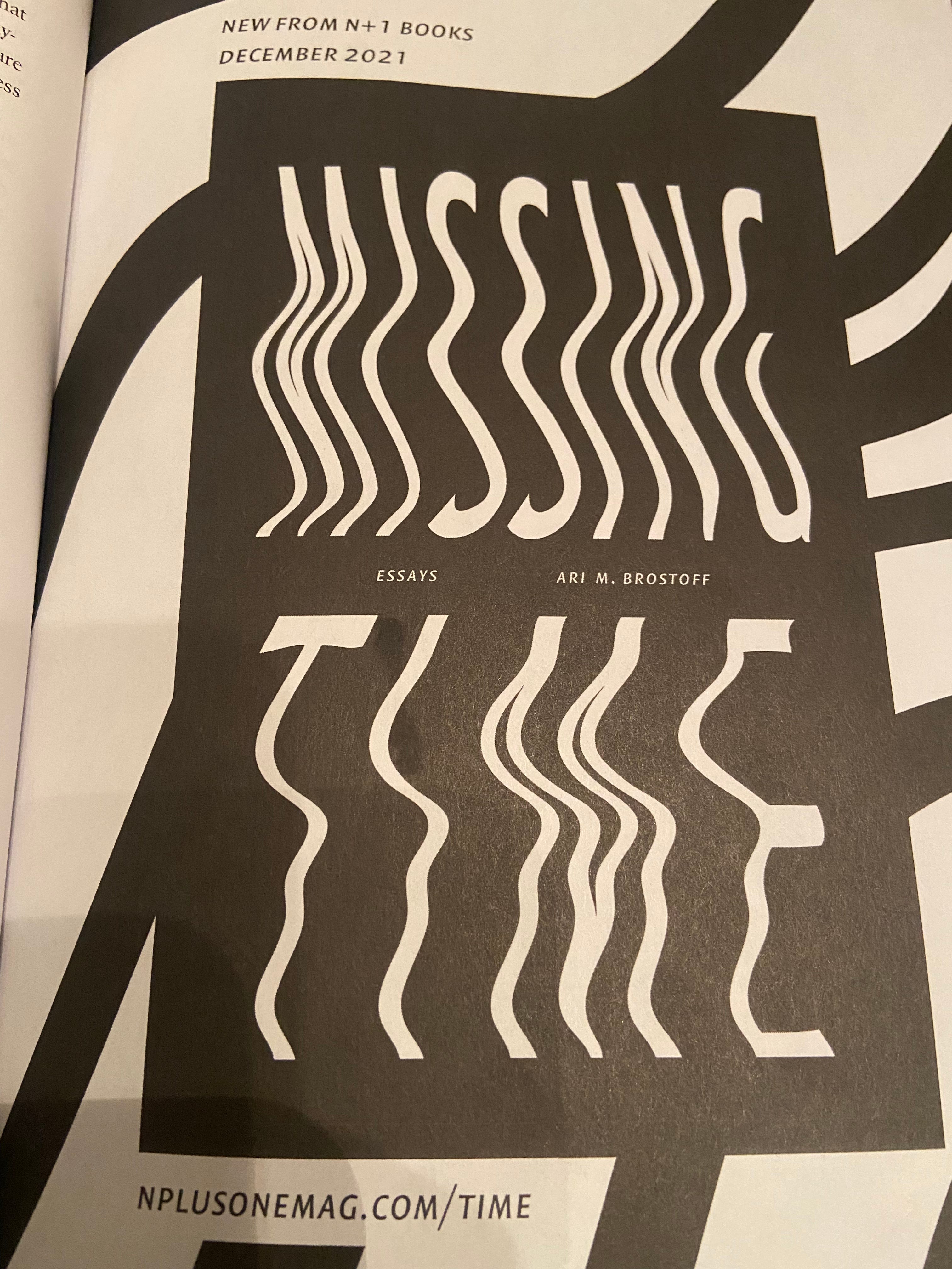
Another ad is for Ari M. Brostoff’s book, coming out on N+1 Books, called Missing Time: Essays. The editors at the N+1 booth at the Brooklyn Book Fair said it will be very good and I’ve liked Brostoff’s writing for the magazine. N+1 Issue: 40 carried an ad for The Drift and and one of the editors wrote my least favorite piece. It’s cute seeing the mags I like trade off ads. Last one just says Subsribe to Dissent and there’s an arrow under the letter n. None of the ads have much pizzaz. Oh well.
Verdict: 3/5
The only thing Jewish Currents advertises is its hatred of Israeli neo-colonial bullshit, which I love. It makes me better informed on my pro-Palestine arguments. My parents still don’t care.
Verdict: 5/5
This was gloriously cool and effectively deranged, thank you!